Introduction
In ZK 8.6 we will bring in three new molds for input widgets: Toggle and switch for the checkbox component, and knob for the slider component. With these new molds, we could present our web pages with more implication rather than the normal checked/unchecked or the normal number scoring. The three molds are exclusively designed for modern users with refreshing look and feel.
New molds for checkbox
New mold for slider
Knob mold, apparently is a knob-like slider, with additional support of mouse wheel and text input.
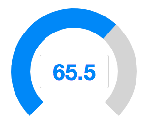
<zk>
   <slider mold="knob" angleArc="270" strokeWidth="40" scaleInput="1.3" width="300px" minpos="0.0" maxpos="100.0" curpos="65.5" step="0.5"/>
</zk>
The following three new attributes are only applicable in knob mold:
- angleArc: sets the angle of the knob
- strokeWidth: sets the width of the stroke
- scaleInput: sets the input scale ratio. e.g. scaleInput=”1.3″, makes the input 1.3 times larger than default.Styling with CSS:
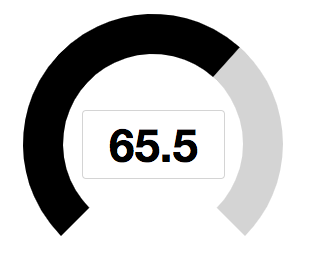
<zk>
	<style>
		.knob-black .z-slider-knob-area {
			stroke: black;
		}
		.knob-black .z-slider-input {
			color: black;
		}
		.knob-black .z-slider-input:hover {
			border-color: #aaa;
		}
	</style>
	<slider mold="knob" sclass="knob-black" width="300px" minpos="0.0" maxpos="100.0" curpos="65.5" step="0.5" angleArc="270" strokeWidth="40" scaleInput="1.3"/>
</zk>
For further information check out component reference.
I hope you liked the new molds. If you have any questions or require any further information, feel free to contact us!