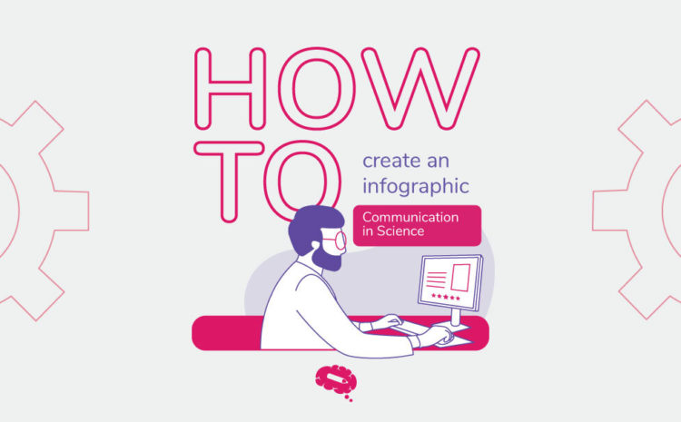
Discover how to make an infographic
Communication is an important part of scientific life. And it’s not only text but also visual! Do you know how to make an infographic for your research paper?
In addition to research and getting solid data, a researcher needs to know how to present their work and communicate well. Finally, it is time for scientists to stop talking only with their pairs. Discover how to make an infographic and reach waaaaaay more people out of your bubble.
This post is the first of the How to Make an Infographic series, with tips and practical examples. This series is a guide made by Mind the Graph designers.
If you want to learn more about how to make an infographic this series is for you.
The power of disinformation
Failed scientific communication creates a gap between science and society. This issue increase pseudoscience, like the vaccine controversy, reduce the funding for scientific research and interest in science by the people in general.
Scientific infographics improving communication in science
Create graphical abstracts, infographics and awesome presentations is a good strategy as it helps you catch up the audience’s attention and reach more people.
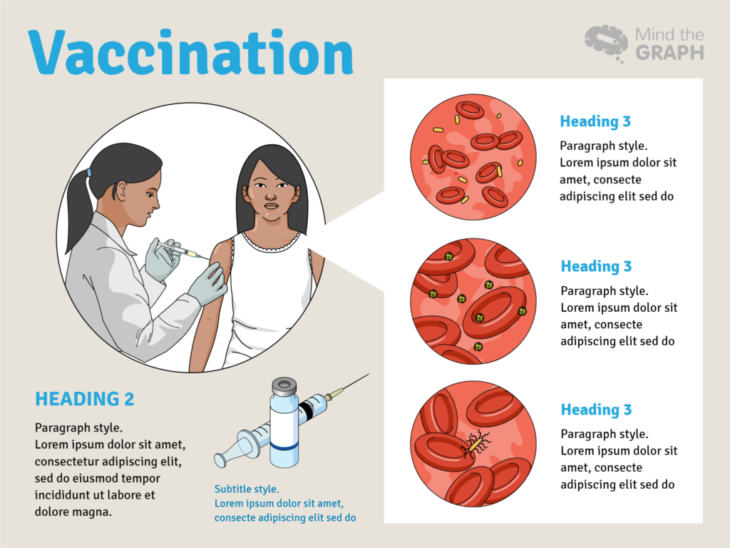
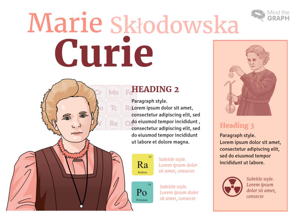
In an infographic, you should present all the relevant information of your work in a clear, visually enjoyable way, so that the reader will be able to understand it by himself.

If you aren’t convinced yet, there are more reasons to use infographics in science:
- Infographics show statistic data in a more intuitive and easy-to-use way, with numbers and text of different sizes, depending on their importance and priority, and images and symbols that help your reader. The arrangement of the elements in a infographic helps a dynamic reading and with a quick glance you can understand the main information.
- An infographic has a huge potential to become popular and shared. The reason is because it is visually appealing and easy to share in social media, emails and more.
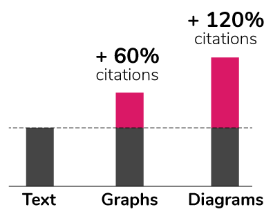
The Economist magazine published in June 2016 that articles with diagrams and graphs tend to be much more cited (about 60% are cited). And more, articles with diagrams reach up to 120%:
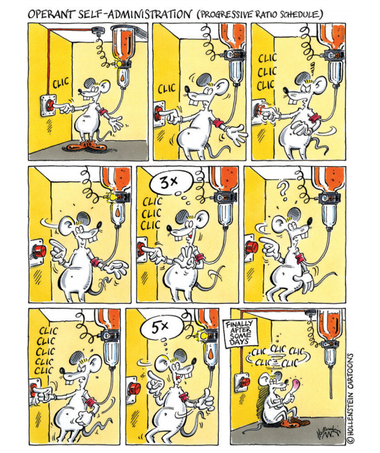
Sanchis-Segura and Spanagel published an article in 2006 with comics illustrations to present the experiments done with mice in the laboratory. This article had more than 160 citations, while their other articles were published in the same year but without this visual resource did not exceed 50 citations.
But well, I know, we are scientists and in general, we do not study how to improve our communication and design skills.
Most of all, our goal is to improve scientific communication. Therefore, Mind the Graph designers created awesome content to help not-designers-scientists. They’ll show how to make an infographic to present your research and stop communicating only with your pairs.
Or you can also start your infographic right now.
Click here to start!
See the rest of our posts on How to make an infographic below.
Plus, Mind the Graph Subscribers receive by email extra material, designed exclusively by the Mind the Graph design team.
How to make an infographic Serie:
- #1 Post – Communication in science
- #2 Post – Make your data Awesome
- #3 Post – The right kind of chart
- #4 Post – Let’s talk about colors!
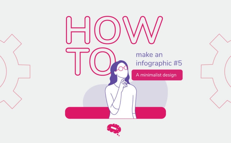
- #5 Post – Less is more: minimalist infographic design
- #6 Post – Mistakes to avoid in science communication
- #7 Post – A shortcut summary to GET IT DONE
Receive free our ebook and learn how to make science infographics and improve your presentations.


Subscribe to our newsletter
Exclusive high quality content about effective visual
communication in science.
