Famed Mac Icon Designer Says iOS 7 Icons Are a 'Good Direction'
 Since its unveiling at the Worldwide Developers Conference keynote, Apple's new user interface for iOS 7 has proven somewhat controversial with pundits and fans debating whether the direction is a good or bad one. Earlier this week, it was reported that Jony Ive had put Apple's marketing team in charge of the look and color palette for the iOS 7 icons, bringing new blood and a fresh perspective to the operating system.
Network World spoke to original Macintosh icon designer Susan Kare and was able to get her thoughts on the new design:
Generally a good direction--am a fan of simple, meaningful symbols that fill a space, such as Music and Weather. It's better -- more iconic, less illustrative.
Kare's thoughts somewhat echo Jony Ive's comments made during the iOS 7 introduction video, in which he noted that simplicity, clarity and efficiency are some of the goals behind iOS 7.
Kare created many of the original interface elements for the Apple Macintosh in the mid-1980s, including the Chicago sans-serif typeface and the "Happy Mac" symbol that greeted early Mac users at startup. She now works as an independent artist.
Popular Stories
Apple is set to unveil iOS 18 during its WWDC keynote on June 10, so the software update is a little over six weeks away from being announced. Below, we recap rumored features and changes planned for the iPhone with iOS 18. iOS 18 will reportedly be the "biggest" update in the iPhone's history, with new ChatGPT-inspired generative AI features, a more customizable Home Screen, and much more....
Apple today released several open source large language models (LLMs) that are designed to run on-device rather than through cloud servers. Called OpenELM (Open-source Efficient Language Models), the LLMs are available on the Hugging Face Hub, a community for sharing AI code. As outlined in a white paper [PDF], there are eight total OpenELM models, four of which were pre-trained using the...
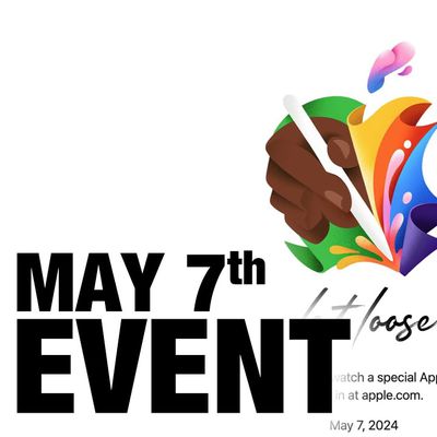
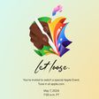
Apple has announced it will be holding a special event on Tuesday, May 7 at 7 a.m. Pacific Time (10 a.m. Eastern Time), with a live stream to be available on Apple.com and on YouTube as usual. The event invitation has a tagline of "Let Loose" and shows an artistic render of an Apple Pencil, suggesting that iPads will be a focus of the event. Subscribe to the MacRumors YouTube channel for more ...
Best Buy is discounting a collection of M3 MacBook Pro computers today, this time focusing on the 14-inch version of the laptop. Every deal in this sale requires you to have a My Best Buy Plus or Total membership, although non-members can still get solid second-best prices on these MacBook Pro models. Note: MacRumors is an affiliate partner with Best Buy. When you click a link and make a...
There are widespread reports of Apple users being locked out of their Apple ID overnight for no apparent reason, requiring a password reset before they can log in again. Users say the sudden inexplicable Apple ID sign-out is occurring across multiple devices. When they attempt to sign in again they are locked out of their account and asked to reset their password in order to regain access. ...
Apple used to regularly increase the base memory of its Macs up until 2011, the same year Tim Cook was appointed CEO, charts posted on Mastodon by David Schaub show. Earlier this year, Schaub generated two charts: One showing the base memory capacities of Apple's all-in-one Macs from 1984 onwards, and a second depicting Apple's consumer laptop base RAM from 1999 onwards. Both charts were...
![]() Since its unveiling at the Worldwide Developers Conference keynote, Apple's new user interface for iOS 7 has proven somewhat controversial with pundits and fans debating whether the direction is a good or bad one. Earlier this week, it was reported that Jony Ive had put Apple's marketing team in charge of the look and color palette for the iOS 7 icons, bringing new blood and a fresh perspective to the operating system.
Since its unveiling at the Worldwide Developers Conference keynote, Apple's new user interface for iOS 7 has proven somewhat controversial with pundits and fans debating whether the direction is a good or bad one. Earlier this week, it was reported that Jony Ive had put Apple's marketing team in charge of the look and color palette for the iOS 7 icons, bringing new blood and a fresh perspective to the operating system.














Top Rated Comments
It amazes me how everybody is so ******* sure of themselves when it comes to design. Like their opinion is the de facto standard for beauty in the world. Get over yourselves. Design is hard. It's also something that one gets better at as one does it more. This is Apple's first stab at a different direction and I think too, that they are going in a cool direction.
To call something downright "ugly" based on your personal taste is bold and usually pretty arrogant, just saying.
Un-famous poster is also wrong.
Opinions on design cannot be right or wrong.
I'm all for clean-looking, simple icons, as I think most of us are, the problem is more with the weird color palette, exaggerated gradients with an inconsistent direction and general lack of consistency between the complexity of shapes, the level of flatness and use (or not) of metaphors.
I think it's a good thing Apple has reacted and justified the current icons, it means they are "fixing" things as we speak. In fact, the internal build Apple had when they released the first beta was more advanced than what developers are using today.
The new icons on Apple's website are defenitely better exectuted while keeping the same original design language. I want to see more of that:
It's still far from perfect but changes are made on the right path.
Or you know, personal opinion.
Replace the word ugly with beautiful and read your post again.
D.
I think we're going to see much better updates to iOS from now on. I don't know why, just a feeling. But I mean, they seemed so much more happier up there than with any other presentation since Jobs last took the stage. It's like they were no longer confined to something. They seemed to now have a real sense of where they want to take it, more of a vision for the future.
I really like how much more "alive" the OS seems now. One of the biggest things I felt with iOS was that it felt very static and stiff. While using it every day, and especially where there was heavy skeumorphism, I found myself wanting to use it in a way that seemed like it would/should work in that way, but did not. It felt very confined. For example, you HAVE to press the "back" button to go back. But a swipe makes so much sense, and after some apps started to have that kind of gesturing, I really started to want it in the OS as well and wondered why they never did that.
So even if there's a few crappy icons, I'm really excited about the future that iOS 7 is ushering in.
Time will tell of course, but under Forstal, things seemed to be going very slowly. Now I feel like things will be going faster, a focus on more important features, more gestures, and slowly perhaps even more openness.