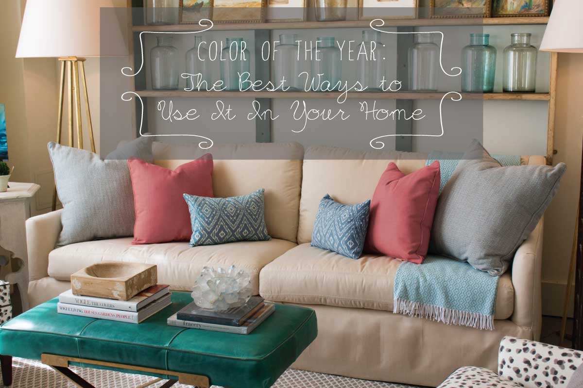
 Surprise! It’s twins! Pantone® chose not one, but two colors of the year for 2016: Rose Quartz and Serenity. While these colors are often associated with innocence and childhood, there is no reason they should be restricted for only that use. Rose Quartz and Serenity are both calming and relaxing colors that can easily transform any room in your home into a tranquil room for relaxation.
Rose Quartz + Neutrals = Luxury
Why did Pantone choose Rose Quartz? “Rose Quartz is a persuasive, yet gentle tone that conveys compassion and a sense of composure,” states Pantone. This gorgeous color paired with a mix of neutrals, turns a subtle tone into one of luxury without putting too much effort into your décor. With its new trend, Rose Quartz is quickly becoming a new neutral color, changing the mood to any room and creating a timeless appeal.
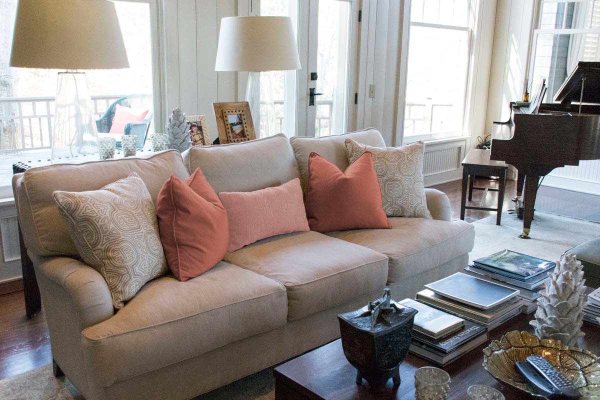
Rose Quartz + Shades of Pink = Distinct Elegance
Another great combination is with complementary shades of pink. Adding a mix of patterns and colors to your living room creates interest in your space, and the simplest way to do that is with new throw pillows. Since pink offers a wide variety of tones within its color family, this one color provides limitless pairs with other shades.
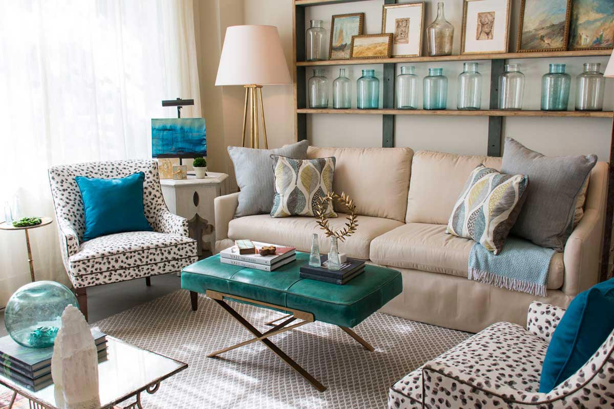
Get Ready to Relax with the New Blue, Serenity
Pantone didn’t stop with pink. They go on to say, “Serenity is weightless and airy, like the expanse of the blue sky above us, bringing feelings of respite and relaxation even in turbulent times.” With busy schedules of our day-to-day lives, doesn’t that description make you want to use Serenity in your home right now? Nestled within the blue color family, Serenity is also considered a calming color. It too blends well with neutrals which makes it perfectly fitting to pair it with Rose Quartz.
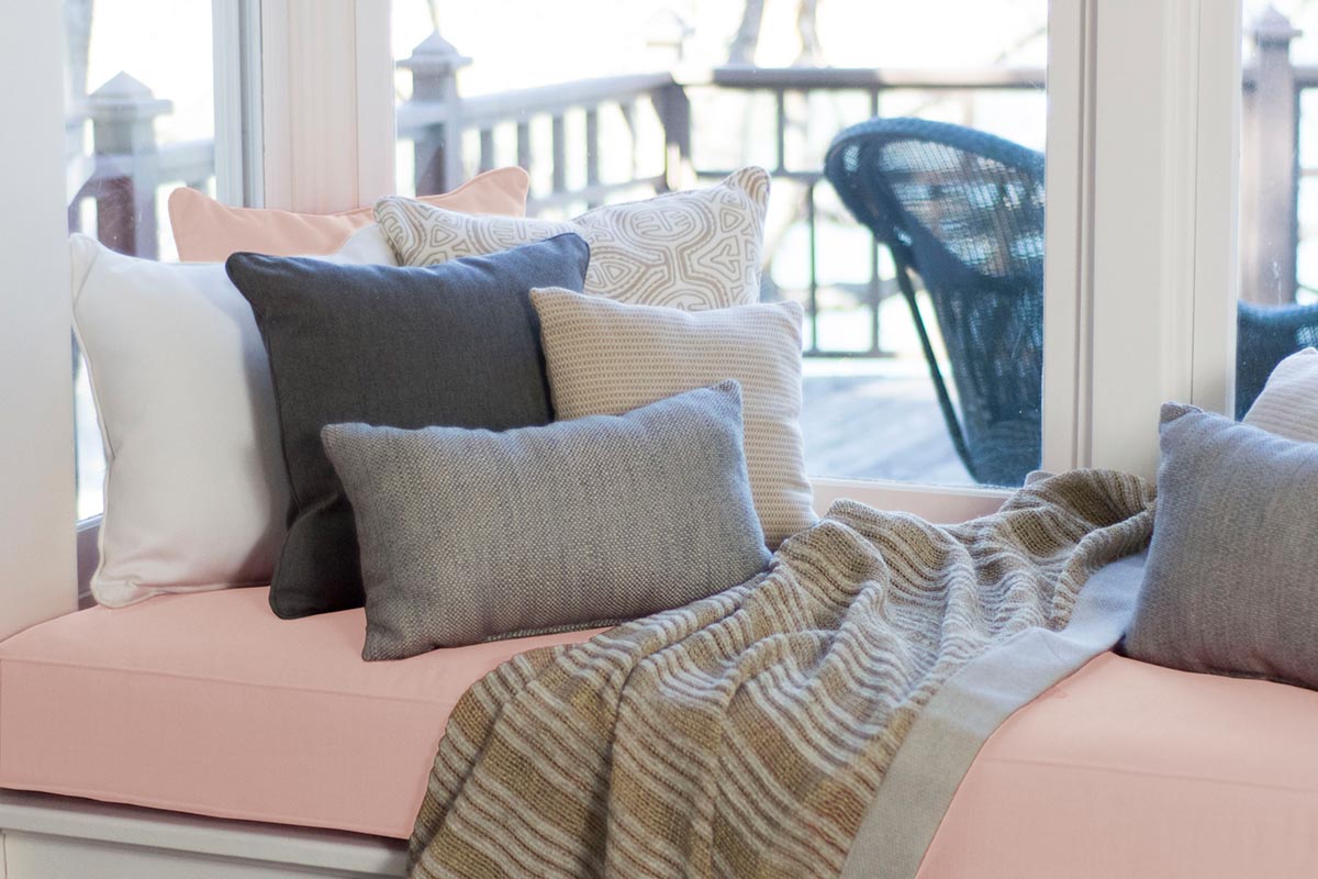
Serenity + Neutrals = Always Inviting
Blues are one of the easiest colors to use within a home. Incorporating shades of blue into a room brings a welcoming and inviting feeling. Colors with the blue family inspire sincerity, breath, peace, and honesty. Mixing them with earth tones helps accentuate the peaceful spirit of the colors creating a space that is open and inviting to relaxation and honest communication.
So when you are you ready to unwind after a long day, blues are there to help take care of you. By tossing a mixture of neutral and blue throw pillows into a living space you can quickly turn your favorite place into a place to relax. You can also add shades of blue using other décor, such a vases or artwork, to balance the flow of color from your throw pillows and seating.
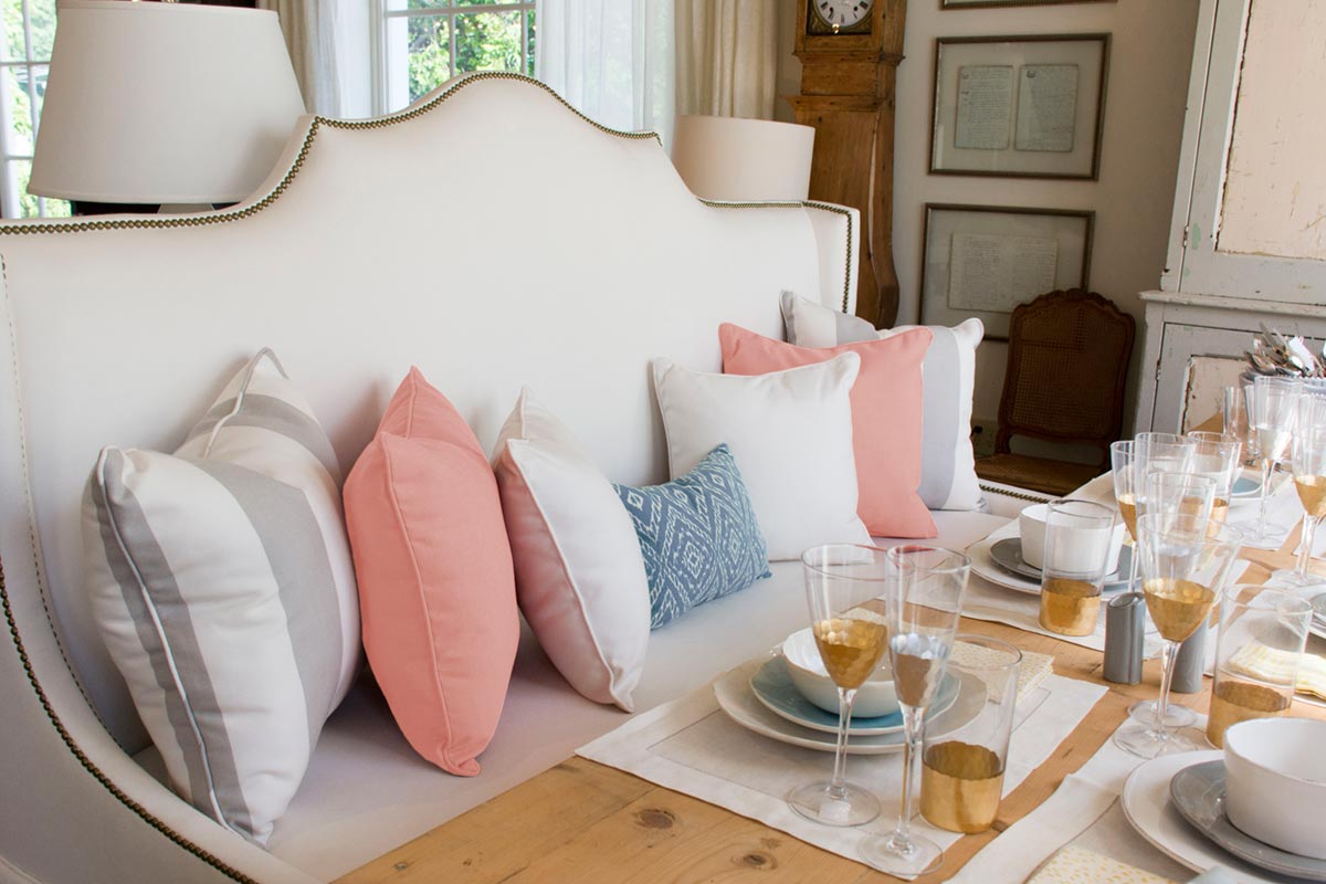
Rose Quartz + Serenity = Divine Taste
Decorating with both Rose Quartz and Serenity separately may seem like an easier task than using them together. Just as you can decorate with them separately using different tones, you can do the same when decorating with them together. While most people wouldn’t think to use a light shade of pink and blue together in main areas of their home, it ends up giving a sophisticated look when used together.
If you are looking to update a room in your home, following the trend of Pantone’s Color of the Year is a great way to start. There are so many opportunities to use Rose Quartz and Serenity in any room of your home. If you need a little more color inspiration, these few favorite fabrics should help you out!
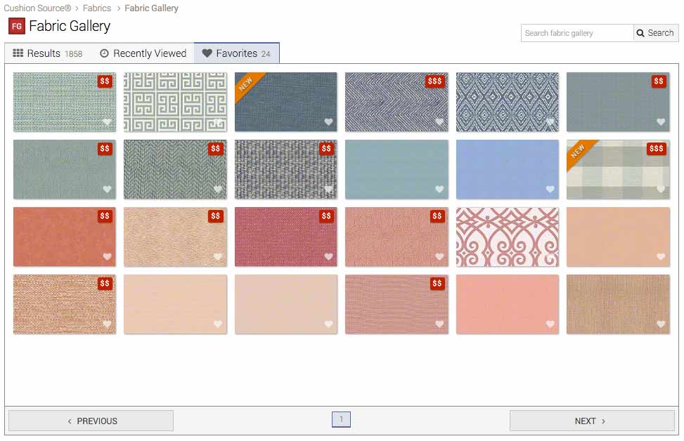
Inspirational Fabrics:
Serenity:
- Sunbrella Hybrid Sky
- Premier Prints Towers Village Blue Natural
- Highland Taylor Sea Dew Denim
- Robert Allen Webberville Iris
- Robert Allen Strie Ikat Rain
- Highland Taylor Silk Dupioni French Blue
- Highland Taylor Matelasse Bloom Summer Sky
- Highland Taylor Herringbone Chambray
- Highland Taylor Sorbet Chambray
- Sunbrella Mineral Blue
- Sunbrella Air Blue
- Robert Allen Checkered Out Blue Opal
Rose Quartz:
- Highland Taylor Velvet Coral
- Highland Taylor Silk Dupioni Rose
- Highland Taylor Nimes Peony
- Highland Taylor Matelasse Bloom Rose
- Highland Taylor Gates Blush
- Highland Taylor SW France Rose
- Highland Taylor Sorbet Blush
- Highland Taylor Boulevard Blush
- Highland Taylor Pacific Blush
- PARA` Tempotest Michelangelo Cosmos
- PARA` Tempotest Home Canvas Pink
- Sunbrella Cast Petal