

How easy is it for your player to put their intention into action, or to understand what's going on in your game? In this tutorial, you'll learn how to build a better game UI by examining both good and bad examples from existing games, and end up with a checklist of questions to guide you through designing them.
By the way, you should check out our UI and UX design guide for 2020 to get up-to-date with the latest trends. And if you're looking for somewhere to get started, you can find a plethora of well-designed game assets on Envato Elements.


Introduction
As gamers and game developers we know that immersion is everything. When you're immersed you lose track of time and become involved in what the game is presenting. A major factor in what makes or breaks immersion is how easy it is for your player to convert an idea into an in-game action -- that is, how fluid your game's User Experience (UX) is and how well-designed its User Interface (UI) is. A game hurts itself by providing too little information or too much, requiring too many inputs, confusing the player with unhelpful prompts or making it hard for a new player to interact. Poor UI design can even break your game completely.


A composited screenshot from Honey Bee Match 3. The top-left half is rendered in green-blind mode by ColorOracle; the bottom-right half is the original. An estimated 1 in 100 people are green-blind, and this game is almost unplayable for them.
In this article I won't be teaching you how to put a UI together. Instead, I'll be focusing on what makes a UI well-designed or poorly-designed, and how you can apply this thinking to your own game. I'll be examining UI and UX design as a series of goals which are as important and as precise as any other part of your game, using examples from games that get it wrong and games that get it right.
What Are UI and UX?
The terms UI and UX are sometimes (incorrectly) used interchangeably, but they have specific meanings.
UI, or User Interface, refers to the methods (keyboard control, mouse control) and interfaces (inventory screen, map screen) through which a user interacts with your game. UX, or User Experience, refers to how intuitive and enjoyable those interactions are.
To look at it another way: the UI of a car is its steering wheel, its pedals, the dials and controls on the dashboard; the UX of the car comes from intangibles like the brake pedal being responsive, the engine smoothly accelerating when you step on the gas, the gear stick having just the right amount of resistance - those things that make the car enjoyable to drive.
What Does a Good UI Do?
Put simply, the role of a good UI is to provide relevant information clearly and quickly, and to get out of the way once it has done its job. If you only take one bit of information from this tutorial, let this be it:
A good UI tells you what you need to know, and then gets out of the way.
We can go further and boil down the process of UI design to six fundamental questions:
- Does this interface tell me what I need to know right now?
- Is it easy to find the information I'm looking for, or do I have to look around for it? (Are the menus nested so deep that they hide information from the player?)
- Can I use this interface without having to read instructions elsewhere?
- Are the things I can do on this screen obvious?
- Do I ever need to wait for the interface to load or play an animation?
- Are there any tedious or repetitive tasks that I can shorten (with a shortcut key, for example) or remove entirely?
Ask these questions frequently as you design and play your game. The world of UI design is a world of endless nitpicking, and it's one of the few areas of game development where it's okay to obsess.
Case in Point
One good example is Fallout 3's Pipboy - or, more specifically, the short animation of your character raising the Pipboy to eye level whenever you access it:
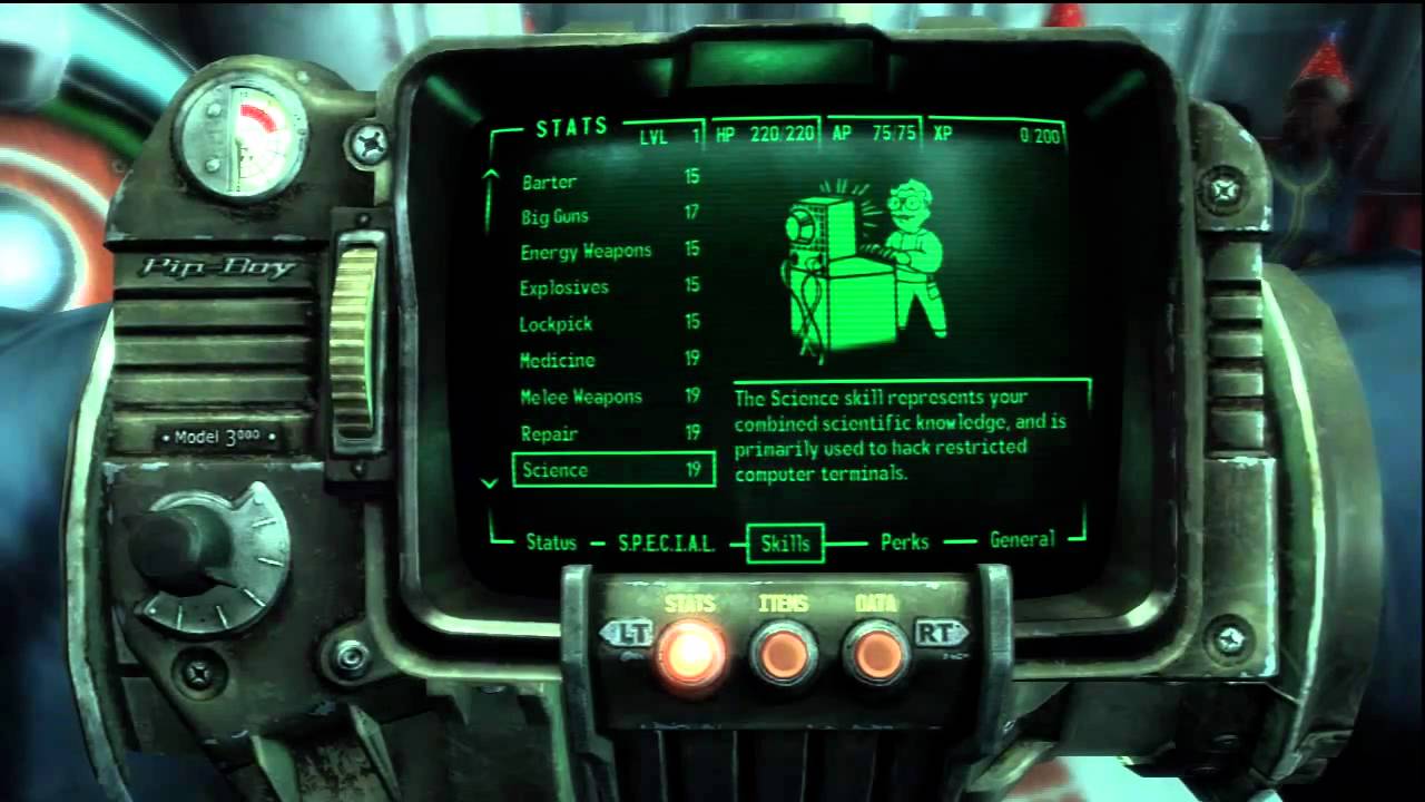
The animation lasts for only half a second, so you might not put much thought into it. But watch how it challenges the patience of your players after sitting through it countless times over the course of an 80 hour game. Never conclude that your player will "get used to" doing something in a non-optimal way. They will only seethe and bad-mouth your lack of design sense.
How Can I Practice Designing UIs?
I believe that the single best way to learn UI design is to make websites. Amazing resources like Jakob Nielsen's Alertbox exist to give you as much information as you want about what exactly makes a UI easy to use, how people interact with software and so on.
Editor's Note: And there's always our sister site Webdesigntuts+...
At the center of what makes a good UI is usability, an attribute that incorporates the answers to the six fundamental questions mentioned previously. There's much more to be said about usability and making your interface usable, and I leave it to you to pick over Alertbox and find the parts that are relevant to your experience.
Who Should Design a Game's UI?
Many programmers are scared off from making UIs because they feel that this is a creative job, one better left to someone like an artist who has a better understand of presentation. And yet UI design is a largely logical process, one that's perfectly approachable to a developer.
In fact, I believe that the programmer (or creative director, or whoever in your team has the most direct role in shaping the playing experience of your game) should be responsible for making the UI, as they are the ones who know the game inside and out, and who know what information is important and what is incidental.
They should focus on the functional aspects of the UI: How big is it, does it (or should it) scroll, what information is displayed and where, and how the player navigates through it. Mock it up with two or three colors, and never rely on color changes alone to convey information. At the very least, run it through ColorOracle or Coblis to ensure that color-blind people aren't missing out.
Games With Poor UIs
Before getting into this, it's important to understand that when I talk about bad UIs, I make that judgement based on the ideas and behaviours that I bring to it as a PC gamer who plays games with a keyboard and mouse.
The user's choice of input is extremely relevant to the user experience, although it's not the whole story. Someone who is used to a touch interface is going to find a button interface awkward, for example, but a well-designed button interface will still be easy to understand and predict.
Oblivion
Oblivion's UI is a classic example of one platform's UI being incompatible with another. Even though Oblivion was ported from consoles to PC, it still retained its controller-focused UI. This is completely analogous to releasing a game on iOS or Android and making the player move an on-screen cursor around like they're using a laptop's trackpad instead of taking advantage of absolute touch positioning.
So what makes Oblivion's UI so bad? It's a combination of wasted space, improper scaling, and inappropriate controls.


I hope you're cool with viewing six items at a time; these windows aren't adjustable. The actual part of the menu that conveys the relevant information, such as the contents of your inventory, uses only 21.7% of the total screen space at a resolution of 1920x1080.


Using only a fifth of a screen isn't that bad: you can do a lot in that much space. The real problem is that the font and icons are double the size they need to be for viewing on a PC monitor, and this greatly limits the number of items that can be displayed.
A linear list view also means that you tend to do a lot of scrolling, and the tabbed interface hides everything from you. Checking your status effects involves clicking on the Magic tab, going to the Effects sub-tab, then scrolling through the list. It's one thing to hide seldom-used information like character stats behind tabs, but completely different to hide important information such as what is draining your health while you walk around.
Oblivion also lacks shortcuts. There's no Map button to bring up the map; you have to click on the compass to bring up the Map tab. There's no Quick-Sell key or Sell Stack shortcut; you've got to work the quantity slider with your mouse and confirm it by clicking or hitting Enter. There's no standard button for getting out of a window (Escape in most games), so exiting different windows is done by pressing either E, Tab, Escape or some other key.
The sequel, Skyrim, would go on to fix some of these problems, but some would remain or become worse. I actually got stuck the first time I opened a chest in Skyrim: Escape didn't get me out of that window; the inventory key didn't get me out; trying to Use the chest again didn't get me out. There was no button you could click to exit or prompt that told you what to do. Clicking outside the window didn't work. Guess what key finally let me exit the chest? Sheathe/Ready Weapon, of course.
Far Cry 3
Far Cry 3's menus are really awkward for a PC user. Sometimes it doesn't respond to clicks so you have to click three times; menus can take some time to load; it's not really space-efficient - you know the deal by now.
It was patched, so I'm going to focus on the state of its in-game HUD when it was first released. Let's start with a look at the HUD in its predecessor, Far Cry 2.


This is what you see most of the time. Things like health indicators and ammo count fade in and out as you need them, but in general the HUD leaves you alone.
Now let's look at Far Cry 3's HUD.


Far Cry 3's HUD doesn't leave you alone. I have a hard time showing it in screenshots or videos; it's just something that you experience as a player who keeps getting jerked back into reality. It creates a claustrophobic feeling.
The minimap is large and opaque, so it gets in your way. The objective reminder in the top left is also large and opaque and gets in your way, and although it disappears after a few seconds it has a tendency to reappear just as you're about to start forgetting that you're playing a game. When you get shot the hit indicators appear near the center of the screen where they again get in your way, instead of appearing at the very edges of the screen like in every other game. If you gather enough crafting ingredients, another big, opaque popup appears on the right to let you know that you can craft something new.


Every time one of these popups appears it snaps the player out of whatever fun they were having and reminds them that they're using software. The over-supply of obvious information makes it feel like the game doesn't trust the player to be competent. The patch lets you turn off the worst of these HUD features, but the minimap is still there, and the menus are still awkward for mouse and keyboard interaction.
Games With Good UIs
But let's not spend all this time talking about bad UIs. Great examples of UIs come from games which acknowledge the limitations and strengths of their systems.
Morrowind
Most PC gamers agree that Morrowind (Oblivion's predecessor) has one of the best PC UIs around - except for one issue which I'll talk about below.


Let's go over the basic elements of this screen.
- It's a single screen with four different, untabbed windows. Clockwise from top-left you have the character details, the map (which you can zoom), your list of spells and magic items, and your inventory (with tabs for sorting items).
- At the top-right of each of these windows is a small raised square. If you click this square, then that particular window will remain on-screen even after you exit Menu mode. You can keep the map window open if you're trying to completely map the coast, for example, or you can keep the Magic window open to keep an eye on the number of charges left in your Ring of Healing.
- You can drag these windows anywhere on the screen, and you can resize them or minimize them to tailor the UI to your needs.
- At the bottom-right of the screen are some status icons. If you see an unfamiliar icon there you can hover over it in Menu mode, and a tooltip will tell you what it is. The same icons appear at the top of the Magic window too.
- The inventory is laid out in a space-efficient grid, and you can adjust the number of items it displays by resizing the inventory screen.
What does this UI mean for the PC player? Almost everything is literally one click away. If you want to look at your skills you scroll the character window. If you want to equip something, you drag it onto your paper doll. The interface is fast and accessible, and almost every type of item in the world has a unique inventory icon, so finding your Journeyman Hammer involves half a second of looking at your neat, scalable inventory.
The only detail that lets this UI down is the fact that potions and scrolls reuse inventory icons; there are unique icons for the quality of the potion, but not for its effect, so a Master Water Breathing potion looks just like a Master Restore Fatigue potion.
Beyond Good and Evil
Text entry with a controller is inconvenient at the best of times, and painful in the worst. You can't move your fingers directly to a key, you've got to button-press your way there, creating a lot of unnecessary movements and actions.
Beyond Good and Evil sidestepped all of this by implementing what's commonly accepted as the best console text input scheme ever: An infinite ribbon with letters and numbers arranged on it in order. The ribbon scrolls fast and without delay, it provides constant aural feedback, and it's responsive to adjustments. It's a mystery why other games have not followed its example.

Well I've been a little unfair. Other keyboard-style text input screens do allow you to hold down a direction and scroll through all of the keys sequentially, but they often have a delay before they start scrolling at full speed, or they don't scroll fast enough. (Remember the fundamental question, "Do I ever need to wait for the interface to load or play an animation?")
Homeworld
Homeworld broke ground back in 1999 for being the first RTS with true three-dimensional movement. Being able to move units along three axes was a new design challenge, and Homeworld absolutely delivered with style and elegance. The problem: How to represent 3D movement on a 2D plane (your monitor).
The solution: First, deal with the traditional horizontal plane that gamers are used to.


Then, deal with the extra vertical plane.


The movement screen also gives the player some subtle but powerful tools:
- Notice the compass ring outside the movement range of these Scouts. Homeworld's maps are big and empty, and compass headings are important for orienting yourself in local space.
- Look how easy it is to see the lines that make up the functional part of this screen. Some games try to harmonise their UI elements with the game world by making them pale or transparent, but Homeworld doesn't. Empire: Total War is a good counter-example here. The firing arc indicator is made of a thin red line bordered by a white smudge, and it blends into the terrain quite often. Thank goodness for mods and modders.
- There's a nice crosshair in the center of the movement range circle, and it always points to the center of your selected formation. Without it, you'd have to look for the health bars of your selected ships to find out where they are, and health bars can get quite small and dark when a ship is damaged.
- The movement line provides you with a move distance, handy for estimating transit time in a map with no obvious landmarks.
- Look at the Harvester ship just ahead of the Scouts. There's a line protruding through it, terminating in a small circle above. That circle is located on the horizontal plane of the Scouts (the green circle). The line marks how far below or above that plane the Harvester actually is. With these two indicators, moving towards a ship is fast and accurate: move the horizontal plane marker on top of the disc, then drag downwards to the bottom of the line to set the vertical plane.
Crusader Kings 2
Crusader Kings 2 is the kind of complex, multi-layered game that makes you feel dumb. However, its interface does its best to help you through it all. Firstly, there are many Help boxes that pop up until you're comfortable enough with that part of the game to tell it to stop. Secondly, there's this wonderful feature. Say I want to know what an icon of coins represents; I just hover over it and BAM!


The tooltip looks a little disembodied here because the pointer isn't captured in screenshots.
A wild tooltip appeared! The game tells me what to call the coins icon, gives me the information relevant to it, and even tells me how that information is organised. You can do this with any other element in the game, and the tooltip appears quickly so I don't have to wait.
You might look at this and say, "Duh, tooltips have been around forever. Of course one should pop out when I hover over something." Just keep it in mind, as it's easy to forget.
A Valley Without Wind
One place where it's particularly easy to forget about tooltips is in the front-facing menus of your game. Here is the Vsync tooltip in A Valley Without Wind's Options menu.


Here is the Vsync tooltip in Half Life 2: Episode 2's Options menu.


Really helpful. Most PC gamers who wander into the Advanced graphics options will know what VSync is, but placing a tooltip is just polite - just as long as it's a helpful tooltip and not one that reads, "Turns VSync on or off."
Civilization 5
Civ 5's city screen is a great example of making information available quickly.


This single screen tells you: the economic and cultural state of your whole empire; the production of this city, including population growth (and border growth if the building list is collapsed); the units and buildings available to this city and how long it will take to construct them; the sprawl of your city, as well as the resource tiles within it and which tiles citizens are currently working; the buildings already built within it, and a collapsed Citizen Management panel where you can switch to different worker allocation profiles to specialise this city's output.
You can also move workers between tiles right on the map of the city, putting all this screen space to good use.
Conclusion
Let's recast the six fundamental questions of UI design as six general guidelines:
- Predict what the user wants to know, and give them that information.
- Information must be easy to find.
- Your UI should be easy to use and navigate. Use established patterns where you can: Everyone knows that Ctrl-Click adds items to the selection, so don't make it swap items instead.
- Make the user's location in the menu system obvious, and make it obvious where the user can go and what they can do from there.
- Minimise load times and avoid animations in your menus.
- Eliminate or simplify repetitive tasks.
UI design is a logical job that you shouldn't be scared of doing. Pay attention to the games you play, take note of how they present information and how that makes you feel. Take note of things that you do repetitively, and how they could be improved. Look for information that acts only as decoration, and consider what you would replace it with. Pay attention to things that confuse you. And finally, always have some people play-test your game in front of you. Tell them how to run the game, then watch silently and resist the urge to guide them. It's quite humbling.


