


Trend Forecast: Key Colours for 2016
From romantic dusty pinks to dark and moody blues, 2016 colour trends are sure to have something to suit all tastes
Anne Ellard
3 December 2015
Houzz Australia Contributor. Kitchen designer at Kitchens by Kathie in Brisbane, Australia. I strongly believe that above all else, the most important thing when designing a kitchen is creating something that the client loves!
Houzz Australia Contributor. Kitchen designer at Kitchens by Kathie in Brisbane,... More
For many of us, a new year signifies a new start, often in the form of resolutions. If one of your new year’s resolutions is to inject some updated colour into your home, then this guide will help to ensure you are on trend. Four colour experts from some of Australia’s most loved paint companies, tell us about what colours will be popping up in homes across the country in 2016.
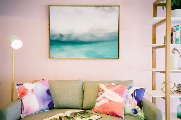
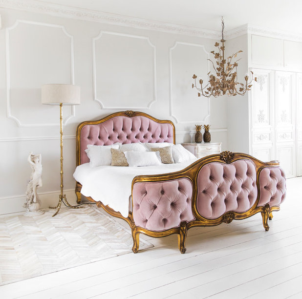
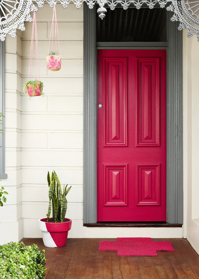
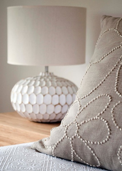
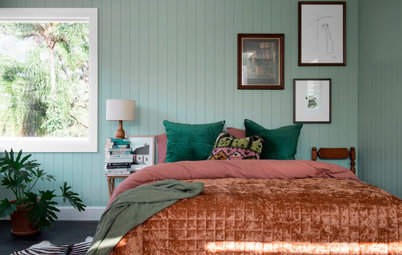
Pink blush
Dusty pinks and feminine blush colours will be a huge look for next year. Their popularity is being predicted by Porter’s Paints, Haymes and Taubmans, so if you are a fan of pastels then you are sure to be on trend in 2016.
According to Shaynna Blaze, Taubmans’ colour consultant and brand ambassador, we should look out for bedlinens, soft furnishings such as cushions and throws, and also candles and accessories in these muted feminine tones. “The blush colours will suit linens and accessories and painted surfaces, like walls,” says Blaze, “but not so much the hard surfaces of your home.”
COLOUR TO USE: ‘Dusted Violet’ from Taubmans
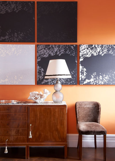
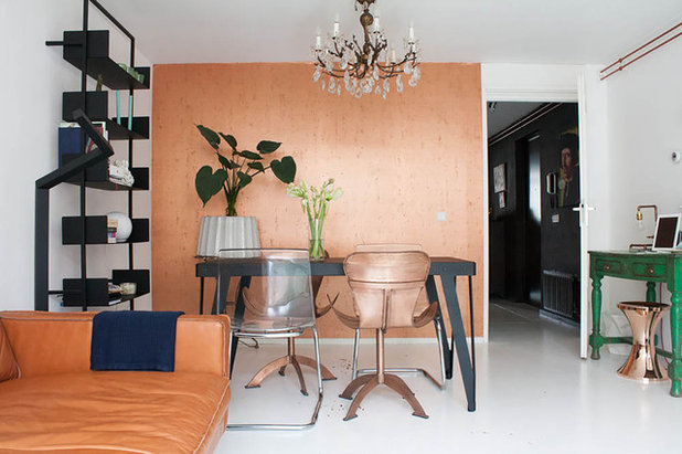
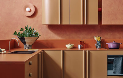
Burnt orange
When I asked Maree Hale from Porter’s Paints what colours she thinks we will be seeing a lot of in 2016, she said that she can see “a stronger pull towards exotic burnt oranges” moving forward into 2016.
DESIGNER TIP: “Consider teaming burnt oranges with natural timbers and charcoals for an earthy appearance. Or to amp up the glamour, add elements of blue/black and gold for a chic effect,” suggests Hale.
COLOUR TO USE: ‘Lhasa’ from Porter’s Paints
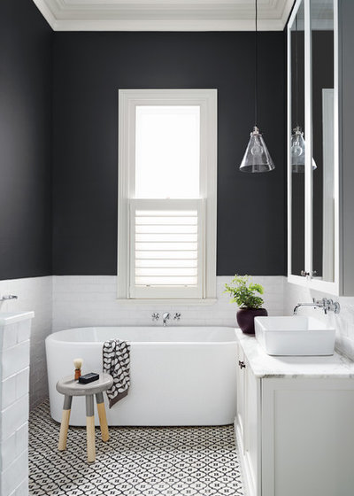
Smoky greys
Fiona Parry-Jones, creative director at Von Haus Design Studio (Haymes) predicts a subdued palette for the new year. “Two colours I think will get noticed a lot in 2016 are the more earthy pastels like smoky greys and peachy pinks that reference natural and chalky minerals,” she says.
If you love grey and white marble then you will be glad to hear it will still be a big hit in 2016. Parry-Jones suggests adding brass to the look to create a harmonious space. “Brass will be more popular this year to create the wow factor.”
DESIGNER TIP: Blaze agrees, but advises that if you are keen to achieve a grown-up feel, the colours can not only be layered with metallics but also finished with touches of deep navy.
COLOUR TO USE: ‘Grey Shadow‘ or ‘Smoky Silhouette’ from Haymes
White wash
A muted palette of pinks and greys can be used to create a simplistic feel that is also very elegant and earthy, perfect in both bedrooms and living areas.
“White-washed linen bedcovers and pink velvets will be a highlight,” says Parry-Jones, “and I think we will see a lot of handmade ceramics and porcelain in lighting and unique sculpted homewares.”
She also suggests layering these colours with chalky whites, natural stones and metallics to create subtle textures and relaxed spaces.
COLOUR TO USE: ‘Iris White’ from Haymes
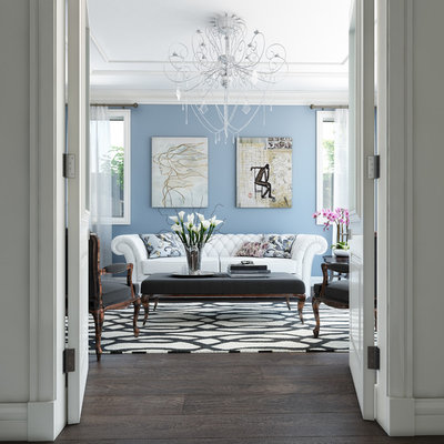
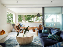
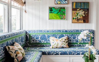
Blue hues
Soft pastel tones as we know them will be receiving an injection of sophistication in 2016, according to Blaze. “In the new year, there will be a few new colourways on trend,” she says. “The most popular shades will be smoky blues and greys teamed with feminine blush colours.”
Lounge rooms and bedrooms will benefit the most from this soft and soothing colour trend. But Blaze suggests we introduce these shades into other rooms of the house as well. They can be used on almost any surface such as walls, soft furnishings, kitchen surfaces and “even hard surfaces like flooring and tiles,” she says.
COLOUR TO USE: ‘Blue Thistle’ from Taubmans
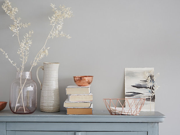
Rose gold
When incorporating colours into a space in our homes, Maree Hale from Porter’s recommends we “first consider the atmosphere you would like to create, and layer elements to create an enriching space.”
“Teaming pinks with touches of rose gold and a slightly blue or purple-based grey can provide a graphic quality or, for subtle glamour, consider a mid-tone linen colouring,” says Hale.
COLOUR TO USE: ‘Rock Salt’ from Porter’s Paints
Deep rose
Hale says that along with burnt oranges, we will see a lot of “dusty pinks in all strengths”.
DESIGNER TIP: Add visual interest by playing around with tone and texture. Hale says we can achieve this by “using a colour from the same family but in different strengths and sheen levels,” such as a flat matt finish teamed with a glossy enamel.
COLOUR TO USE: ‘Scarlet Ribbons’ from Dulux
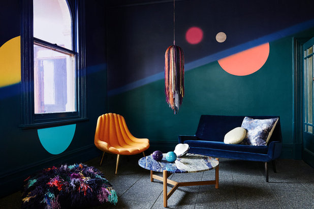
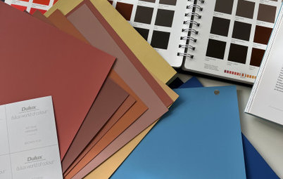
Moody blue
Dulux Colour Planning & Communications Manager Andrea Lucena-Orr says that “an emphasis on dark, moody hues will heavily influence design in the coming year.” This look can be seen in the Dulux 2016 Colour Trends Infinite Worlds palette, which consists of deep greens and blues with pops of yellow and pink.
DESIGNER TIP: Lucena-Orr suggests adding accessories and soft furnishings in acid tones, such as vibrant yellows and greens, to a room to inject an unexpected yet welcome splash of colour.
COLOUR TO USE: ‘Night Life’ from Dulux
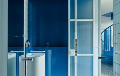
Charcoal contrast
Continuing her dark-toned prediction, Lucena-Orr says to look out for moody sea blues, dark purples, deep blue greens and even charcoal tones to create a striking look. If you are brave enough to go dark, then using these colours on your walls will create a dramatic effect. Otherwise they can be used on furniture and accessories against a more subtle background.
COLOUR TO USE: ‘Domino’ from Dulux
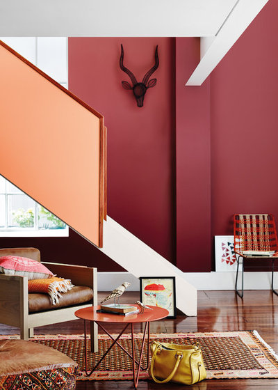
Desert red
Use rich deep colours to evoke emotions, and add to the ambience in a room. From contemporary bedrooms to a classic living room, such colours “can be easily adapted to virtually any room in the home,” says Lucena-Orr.
Choosing deep, rich colourways is a very specific look so she suggests you “also need to review your existing furnishings to ensure the tones will work with fittings that cannot be changed easily. You may need to swap over furniture within your home to add to the ambience.”
DESIGNER TIP: “Consider the lighting in the space to ensure you are making the most of natural daylight and creating a beautiful experience,” advises Lucena-Orr.
COLOUR TO USE: ‘Marrakesh Red’ from Dulux
Tailored taupe
Shaynna Blaze has another prediction for us: “The unexpected colour trend this year is a taupe-like shade. As a darker neutral, taupe can be used as an accent for your fresh, new look.”
DESIGNER TIP: Use this colour on accessories such as cushions, throws and lamps against a backdrop of dusty pinks, to create a calming and relaxed space.
COLOUR TO USE: ‘Traveller’ from Taubmans
Find an interior designer in your area
TELL US
Which colours would you like to see more of next year? Share your predictions in the Comments section.
Related Stories
Paint
How to Choose Your Perfect Paint Colours
By Erin Carlyle
Three USA designers share tips to pinpoint your style and mine memories to find the right paint palette for your home
Full Story
Renovating Advice
How to Choose Your Wall Colour to Complement Floors and Furniture
Which colour should I paint my room to suit the flooring and furniture? We've all asked it – and here are the answers
Full Story
Most Popular
How to Pick the Right Paint Colours for Your Federation House
By Joanna Tovia
Roof colour, wall materials and emerging trends all come into play for Federation paint schemes that work
Full Story
Colourful Homes
Suffering From White-Wall Syndrome? How to Add Colour Confidently
White walls are great... until they stop being inspiring. Five paint colour experts share how to transition to colour
Full Story
Expert Opinion
An Interior Designer Reveals How to Mix Colours and Make it Work
By tidgboutique
Don’t want to confine yourself to neutrals but lack the confidence to embrace colours? We have you covered
Full Story
Made Local
Made Local: How Dulux Colour Trends Are Born
Ever wondered how Dulux sees into the future to know the colours we'll be coveting in the year ahead? Here, we find out
Full Story
Houzz Tours
Queensland Houzz: A Cute Cottage Awash With Colour and Pattern
Bold colour, quirky prints and an abundance of art transformed this 1920s cottage into an inviting and relaxing gem
Full Story
Houzz Tours
My Houzz: A Moody, Modernised Home in Melbourne Regains its Charm
The original beauty of this Californian bungalow was lost to unsympathetic updates – see how a designer brought it back
Full Story
Interior Design
20 Honey-Hued Interiors That'll Make You Melt
Our coffee-break escape offers you five minutes' worth of images to inspire and delight. Jump right in...
Full Story
Awards
Paintbrushes Poised! 2023 Dulux Colour Awards Finalists Are In
Looking for interesting ways to add colour at home? Check out these shortlisted projects in the 2023 Dulux Colour Awards
Full Story
Kerrie Langloy7 - Liberty is my favourite store - I don't buy much there but I just adore walking around it. The architecture is fabulous and you feel enveloped by colour - nowhere else has the same atmosphere.
One place I thoroughly recommend ditching white walls is the hallway. We hare a south-facing, narrow hallway that I've repainted from (cheap-sell-a-house) stark white to Dulux Natural White, and although it is an improvement, it's a total pain to keep clean in our rowdy, large family (which I kind of thought would happen). No idea what I'll change it to (or when I'll have the motivation to do it!) but I love seeing colour, so thanks for the interesting article.
to complement a colour scheme as shown in the pic. 6 'Rose Gold' may I suggest my painting "Capricorn" available on Bluethumb at https://bluethumb.com.au/lesley-taylor/Artwork/capricorn-dec22nd-jan-19th-from-the-zodiac-series