My first impression on seeing iOS 7 on my iPhone was: What is this, a My Little Pony theme?
But after scrutinizing, analyzing, deconstructing and living with the new version, I’m ready to declare iOS 7 an unambiguous masterpiece, a stroke of genius, really.
That may sound like a weird thing to say about a fruity, copycat platform that crashes constantly. But it’s true, and I’ll tell you why.
iOS 7 is compatible with iPhone hardware — finally!
About a year ago, I slammed Apple’s embrace of skeuomorphic design as inconsistent, cheesy, ugly and, worst of all, out of sync with Apple’s very strong hardware design sensibility.
But it wasn’t just skeuomorphic weirdness. The overall design of the iOS interface was littered with low-grade tawdriness that contrasted discordantly with the iPhone’s stunningly beautiful, minimalist, functional and clean hardware design.
Specifically, the interface design tended toward the arbitrary. Why corral dialog box information in rounded-corner boxes? Why put decorative starbursts and gloss and other stuff on the icons. The old interface had a lot of arbitrariness, and the new one has very little.
iOS 7 contrasts with iPhone hardware in a good way
In addition to being aesthetically compatible, the new OS contrasts colorwise. The hardware is: mimimum color (black or white and metal all over). The software is: maximum color. The overall effect of this contrast is striking and appealing.
iOS 7 design takes interface reaction to a whole new level
This is what Apple is really good at — making mobile hardware respond appealingly to the touch. Almost every user interaction with iOS 7 triggers an instant and smooth reaction by the interface, and a high-performance one that makes sense rather than being a cheap gimmick.
Tap an icon, and there’s a perfect zoom transition in which the icon becomes the full-screen window. Close the window and it zooms back into an icon. When you tap on a folder icon, then tap on an app icon, it feels really good becuase you’re zooming in first to the microscopic, then to the atomic.
When you tap on the now-circular empty phone buttons, they’re instantly filled solid with gray, which then quickly fades back to their original empty or white state. It’s psychologically satisfying to press them because of the visual feedback.
The calculator buttons respond with the same change-then-fade-back timing as the phone buttons, but with a different animation. A thick black line instantly surrounds each number key when you press it, then quickly becomes thin before returning to its original super-thin state. The Psycological effect is that the button is being physically pressed.
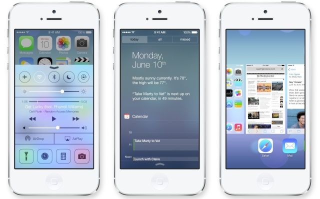
Double-pressing the physical home button brings up a newly designed multitasking bar where you can swipe through running applications. This is the feature critics say Apple stole from the Palm Pre, and this charge is essentially true. However, Apple has made some cool improvements to Palm’s interface.
When you’re in a full-screen application and double-press the home button to get to the multitasking view, the Palm used to zoom out with the “card” you were running in the center. iOS7, on the other hand, zooms out but guesses at and zooms to the “card” you want next. It’s usually really good at guessing.
The other cool thing is that the icon of each running app appears below its screen. Although the cards show the full card of one app in the middle and half the screen of each card to the left and right, the icons are shown in full. That means when you swipe to the next card, the icon moves at a normal pace, but the cards move much faster. This actually has a functional benefit: Swiping across the cards moves the lineup of apps slowly. Swiping across the icons moves is rapidly. In other words, it has two-speed swiping, and you choose the speed by where you swipe.
The Game Center categories are represented by weird floating bubbles. Tapping on one causes the selected bubble to recoil instantly in response, then all the bubbles shrink and fly off the edges of the screen, leaving you in the selected category.
When you’re in the photo view, you see what the camera sees, of course. When you tap the home button, the camera view goes super blury very fast before the app shrinks down into its icon.
These are just a few small examples. What’s important is that Apple has taken the best aspect of the iOS interface — the reactive physics — and has taken it to a whole new thrilling level.
iOS 7 returns Apple to its design roots
After Steve Wozniak invented the personal computer with the Apple II, Apple’s next giant contribution to the field of user interface design was placing a strong graphics design imprint on the platform. Steve Jobs used to say that a college caligraphy class inspired him to add beautiful typefaces to the original Mac, for example.
iOS 7 is shockingly well-rooted in a print-graphical design sensibility. It uses a typeface called Helvetica Neue UltraLight. It’s the kind of face you’d see in a glossy style magazine, not beneath icons. It’s also a typeface that would have been impossible to use on a sub-Retina display.
In fact, the whole design is a pure creature of Retina-quality pixel densities. Apple uses some incredibly thin lines, tiny icons and refined strutures and shapes.
iOS 7 has global appeal
Early accounts of iOS 7 fixated on the bright colors, made more conspicuous by Apple’s use of semi-transparent screens. When you swipe up from the bottom to reveal a new control panel for commonly used controls, for example, the colors of the icons behind the screen appear in a blurry pastel haze. The purple-pink of the iTunes Store icon, the blue-cyan of the App Store icon and other overly bright icons become a blury screen filled with Easter-egg colors.
Here’s the thing: The appeal of one type of color treatment over another is culturally determined. Apple’s super bright iOS 7 colors tend to shock Europeans and Americans, who favor increasingly dark, bleak, post-apocolyptic color schemes. (Just look at Superman’s new suit!) But super-bright colors like the ones in iOS 7 are perennial favorites through Asia, including China and India, and also throughout much of Latin America.
In short, Apple’s color scheme may astonish and disappoint jaded Northern and Western urban geeks. But these colors will be an international crowd-pleaser.
iOS 7 de-commoditizes the mobile user interface
Since Apple launched the iPhone in 2007, the general look and feel of smartphone interfaces has become somewhat commoditized. The new iOS 7 separates Apple from the pack a bit more with a super different-looking interface. Once this has been on the market for awhile, you’ll be able to tell from a distance or in an instant whether a phone is an iPhone or not. (This is true despite the fact that Apple decided to copy the Android animated wallpaper look.)
Regardless of whether you like or dislike, love or hate the user interface of iOS 7, the overall design is a masterpiece of style, function and market differentiation. It’s a great thing for Apple, and a great thing for users. The future for Apple’s mobile interface looks very bright indeed.


