Yet More Charts That Should Go With Debt Discussions
The Globe and Mail in Toronto weighs in with these "infographics," showing the total tax burden that Americans bear in both international and historical perspective.
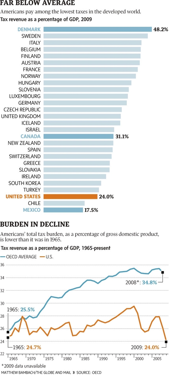
The chart on the top shows how the share of American income that goes to taxes compares with that in other developed countries. The chart on the bottom shows how the U.S. share has changed since 1965.
Now, this comes from a Canadian publication, and it's based on international data, so naturally we have to watch out. For more see the original OECD reports. But I repeat the point that came from two previous sets of charts:
Any discussion of the causes of America's public-debt problems, or any discussion of the solutions to it, that is "spending only," and excludes the role of revenues -- for instance, the discussion that raged through Congress last week -- is a pointless and unrealistic discussion. It is historically ignorant and economically fanciful. You'll note, for instance, that the last time the federal budget was in surplus, 11 years ago, total taxes were higher than they are now. That doesn't prove anything about future policy but is a crucial fact to grasp.
Like any charts, these leave a lot out -- for instance, the exact relationship between tax rates and tax revenue. Also, they have the dreaded "truncated vertical scale," which makes the difference between 24% and 36% look bigger than it is. And nothing in them would suggest that taxes should go up (or that public spending should go down) during a recession. Still, they convey a basic reality that would come as news to most Americans. If you are worried about debt, you must be worried about both taxes and spending. Otherwise, you're not "serious" but just sloganeering.
James Fallows is a contributing writer at The Atlantic and author of the newsletter Breaking the News.