Review: ‘Someday Is Now’ reflects influence of the ‘60s and Warhol on artist Sister Corita
Pope Francis, meet Sister Corita.
The timing is coincidental, but the opening of the large survey exhibition “Someday Is Now: The Art of Corita Kent” resonates with the publication last week of “Laudato Si,’” the pope’s encyclical on the worldly crisis of environmental degradation.
Sister Corita was an activist nun in the 1960s. After she began teaching and making art at Immaculate Heart College in Hollywood, engagement with pressing social and political issues of the day became the focus of her labors, both spiritually and artistically.
Evidence is everywhere among the roughly 250 prints in the show, organized by the Tang Teaching Museum at Skidmore College and newly opened at the Pasadena Museum of California Art. Corita, the single name by which Frances Elizabeth Kent was widely known, made about 800 often colorful, sometimes formally inventive prints on a variety of subjects.
Among them are black civil rights, the Vietnam War, the United Farm Workers struggle and the moral demands of social justice. She worked mainly with a silkscreen reproduction technique. The simple, inexpensive means for making multiple copies signaled her populist orientation.
Corita’s most notable art, made for half a dozen years between 1962 and 1968, also coincides with the first serious expansion of a market for contemporary American painting and sculpture. Her budget prints intentionally stood to the side. Humility found an aesthetic form.
Which is not to say that Corita was timid. Anything but. She infuriated the local Catholic establishment.
Cardinal James Francis McIntyre, described by one historian as “the most extreme right-wing member of the American Catholic hierarchy,” regularly sent his priests to meetings of the John Birch Society. He was a harbinger of what became the religious right in the 1970s and 1980s.
Needless to say, Corita’s enlightened support for Martin Luther King Jr., Cesar Chavez and George McGovern did not sit well with the archdiocese. McIntyre and the Immaculate Heart sisters constantly butted heads. Eventually, in 1968, Corita left the order after a 30-year affiliation.
She moved to Boston, where she lived until 1986 and her death from cancer at 67.
What would McIntyre have thought had he accompanied her to Ferus Gallery on La Cienega Boulevard, where she saw the 1962 debut exhibition of Andy Warhol’s paintings of Campbell’s soup cans? Probably not much, except disgust. But Corita responded in a productive way — by making her first mature print.
It is simplicity itself, composed of three rows of four big dots — flat, irregular, clearly handmade disks in red, green, black, blue and yellow.
For inspiration she had followed Warhol to the supermarket, selecting the spotted Wonder Bread package as her soup can. Her spotted print built a bridge between pure abstraction, pinnacle of Modern art, and vernacular subject matter, a language emphatically down-to-earth.
Corita’s embrace of the vernacular reflects the transformation of Catholicism under the Second Vatican Council, launched by Pope John XXIII — canonized a saint last year and a hero to Pope Francis today. That Rome was an engine for her work is evident in her supermarket selection: It represents the host, symbolic body of Christ, using a bread characterized as wondrous.
The print’s 12 dots reflect the number of ways to build a strong body, as the product’s famous advertisements announced. And they also number the disciples who broke bread at the Last Supper.
Was Corita a Pop artist? That’s how the show frames her, but I don’t think the term really fits.
Pop artists used commercial media imagery to dismantle deeply entrenched shibboleths of Modern art culture. But that’s not what Corita was up to. Instead, she used commercial media imagery to advertise an enlightened liberal humanism, which grew from her religious faith.
Certainly she was inspired by Warhol (also a lifelong Catholic). But unlike the evolving impersonality cherished by the New York artist, who so famously “wanted to be a machine,” Corita placed enormous value on the primacy of the individual artist’s hand.
Corita was a humanist. Warhol, not so much.
One reason she used a silkscreen, she said, was to emphasize its capacity for “close, personal handling of each step in its creation.” But one reason Warhol used silkscreens was so that he could send them out to a commercial shop for fabrication and then turn them over to Gerard Malanga or another studio assistant to be mechanically printed.
Warhol had a “factory.” Corita had a classroom.
It would also be easy to mistake the vibrant rows of colored dots in her print, “wonderbread,” with the paper cut-outs of Matisse or the bouncy prints of Alexander Calder. Likewise, other L.A. artists not identified as Pop were also working with mass media and industrial signs and symbols.
Wallace Berman visualized the music of the spheres emanating from transistor radios, which he printed on a copier machine. Vija Celmins set the immediacy of mass imagery against the slow deliberation of the hand in paintings whose imagery is taken off the TV screen and the cover of Time magazine. Robert Heinecken manipulated photographs gleaned directly from the newsstand.
Perhaps most similar in philosophical aim to Corita, although not in the bleak palette of his mostly gray-toned work, Roger Kuntz made paintings that employ the stark, razor-sharp play of light and shadow on freeways. Street signage saying stop, exit and go one way meditates on questions of salvation and mortality.
Corita had studied art history at USC, earning a master’s degree in 1951 — the same year that she made her first print. (She was already a nun living under vows of poverty and chastity.) Her 1950s prints, with formal, stylized rows of saints or a centralized Virgin or Christ, reflect her study of medieval sculpture.
The prints’ figures are edged in jagged, almost painterly dark lines around thinly applied colors, bringing to mind the graphics of Georges Rouault and Leonard Baskin. It’s as if she was trying to make a luminous image that was like an Expressionist stained-glass window.
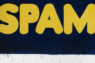
In the ‘60s Corita got formally inventive, often using fragments of words gleaned from familiar product labels or magazine ads. The fragments let you easily fill in the blanks in order to make the picture cohere. Surreptitiously, the clever technique coaxes out language already rattling around inside a viewer’s head.
Sometimes she would fold a printed text, photograph it and then use the “bent” image as the model for cutting her printing stencil. These floating, topsy-turvy printed words become like thoughts in the surrounding atmosphere — an idea that’s “in the air.”
A fine and informative catalog accompanies the show. Among its more interesting features is a selection of commentaries by a younger generation of 20 artists who recall the effect Sister Corita had on their own youthful work. Among them are Lorraine Wild, Lari Pittman, Deborah Kass, Roy Dowell, Andrea Bowers, Jim Isermann and Mike Kelley — a pretty diverse bunch.
Texts played a steadily larger role in her work, however, often to detrimental effect. An aphorism has graphic punch. But full paragraphs — and sometimes more — of poetry or philosophical musing written in calligraphic script turn the sheet on the wall into a manuscript page.
The result can be exasperating. Joyful enthusiasm slides into something close to hectoring.
For a few years in the mid-1960s, though, Sister Corita powered up. The show effectively lays out the story.
More to Read
The biggest entertainment stories
Get our big stories about Hollywood, film, television, music, arts, culture and more right in your inbox as soon as they publish.
You may occasionally receive promotional content from the Los Angeles Times.


