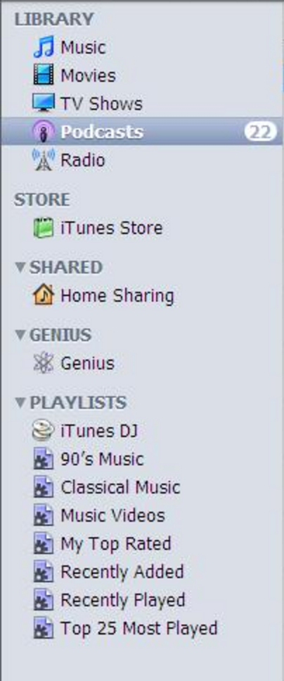
Apple knows that the iTunes interface is extremely confusing and needs work. But apparently its solution is to add even more menus.
Apple released an update to iTunes today that's supposed to give it "a simpler design," supposedly making it easier to navigate between sections to find what you're looking for. To do that, it brings back an old iTunes standby: the lefthand navigation bar, which disappeared a while back.
Great, another menu
The lefthand bar gives quick access to specific views within each section. If you're looking at your music library, for instance, the lefthand bar will let you sort by artist or albums and present the different playlists you've made. It's definitely easier than searching for those items in drop-down menus, like you had to before.
But the update doesn't address the core issue with iTunes' navigation, and perhaps even makes it worse: it's still weirdly difficult to find the section you're looking for — as in, your music library, your video library, or the App Store.
Here's how it worked before:
Do you see those little icons on the left? You had to click between them to change what type of content you're looking at. A whole bunch of stuff is hidden underneath the "..." as well, including podcasts, apps, and audiobooks. Say you want to get to the App Store using this layout. You might think you could just click on iTunes Store and then find the app section; you'd be wrong! You have to click on the "..." menu, then select apps, and then select the Store option in the middle of the navigation bar.
Here's how it works now:
It's pretty much identical, except instead of displaying three icons and a "..." menu, every section is hidden inside of a drop-down menu. Maybe it's better because you can actually read the name of the section you're on, which is a much clearer indicator of how you'd move elsewhere. But if you're like me, and forget how this works every time you open up iTunes, you now have another navigation bar to scan through while figuring out how to get around.
The key improvement here is the removal of the drop-down menu on the righthand side of the screen, which previously held all of the options that are now exposed in the lefthand menu. That's a real help, but the lefthand menu doesn't take over everything. You'll still have to search through those top tabs to find major features, like Apple Music and the App Store. (There is, by the way, no one tab that says "Apple Music" — it's actually a combination of the For You, New, Radio, and Connect tabs.)
I have a proposal for Apple for how it can fix this. I'm not saying it would fix all of iTunes' problems — I'm not even going to argue that it would be a great solution — but it's a quick fix that would dramatically simplify the interface we're looking at today:

Image credit: Urban Guru Cafe.
Yeah, that's iTunes from 10 years ago, with a more sensible lefthand bar. It's not beautiful, but at least I knew how to find the App Store.
:format(webp)/cdn.vox-cdn.com/uploads/chorus_asset/file/15819292/itunes124.0.0.1463422485.png)