17 Jul
8 Unique Benefits of Responsive Web Design [Infographic]
XhtmlJunction
July 17, 2014
June 28, 2019
Responsive Design is a web development style where a website automatically detects the screen size or device on which it is being presented and adapts it accordingly. Having one code that works across all devices, it doesn’t only help developers avoid a lot of maintenance work but also provides users an optimal experience. So the demand of responsive websites is growing rapidly with the adoption of Smart phones and tablets.
Let’s take a look at following statistics:
- Mobile internet usage is expected to overtake PCs by the end of 2014.
- Currently, more than 50% of all local searches are performed on mobile devices.
- According to a recent research study by Google, 98% of people use multiple devices during the same day to accomplish a task.
- A recent ComScore’s report revealed that more than half of the world’s population uses mobile devices to log into social media sites.
- eMarketer, a research analyst company, has made a prediction that over 75% of global users will be using Smartphone before the end of 2017.
All the above facts demonstrate that Responsive Web Design is the future of web design and online marketing. Considering rapid growth in popularity of responsive web design, we’ve designed an infographic that will make you exposed to the reasons why you should adopt this trend.
For more information, take a look at our infographic!
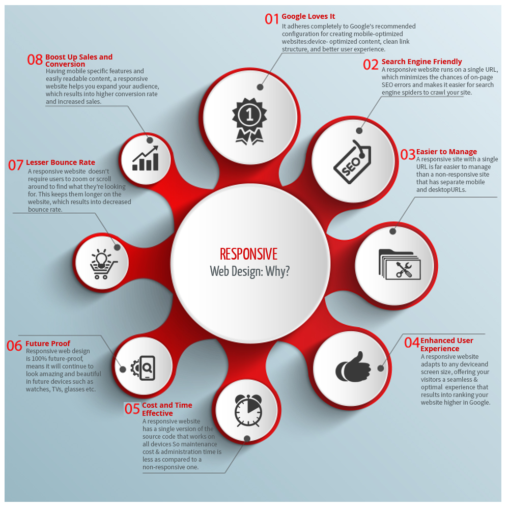
Advantages of Responsive Web Design
1: Google Loves It:
Google recommends using Responsive Web Design, as it adheres completely to their recommended configuration for creating mobile-optimized websites: device-optimized content, clean link structure, and better user experience.
2: SEO Friendly:
A responsive website runs on a single URL, which minimizes the chances of on-page SEO errors and makes it easier for search engine spiders to crawl your site.
3: Easier to Manage:
A responsive site with a single URL is far easier to manage than a non-responsive site that has separate mobile and desktop URLs. If your site is responsive, you just need to update a single set of site files.
4: Enhanced User Experience:
A responsive website adapts to any device and screen size, offering your visitors a seamless and optimal experience that results into ranking your website higher in Google.
5: Cost and Time Effective:
A responsive website has a single version of the source code that works on all devices. So managing a responsive website requires less maintenance cost and administration time as compared to a non-responsive one.
6: Lesser Bounce Rate:
A responsively designed site doesn’t require your users to pinch to zoom or scroll around to find what they’re looking for. This keeps them longer on your website’s pages, which results into decreased bounce rate.
7: Boost Up Sales and Conversion:
Having mobile specific features and easily readable content, a responsive website helps you expand your audience, which results into higher conversion rate and increased sales.
8: Future Proof:
Responsive web design is 100% future-proof, means it will continue to look amazing and beautiful in future devices such as watches, TVs, glasses etc. You just need to update your content, instead of building a new website yearly.